Chegg Signed-in Homepage
- Date: 4/2017
- My Role: UX Lead
- Platforms: Web
Goal / Results: Overall Engagement: +40% / +70% Our goal for this project was for students to better utilize our signed-in homepage and increase overall engagement. Many students were just jumping into another portion of our site and not coming back to the page.
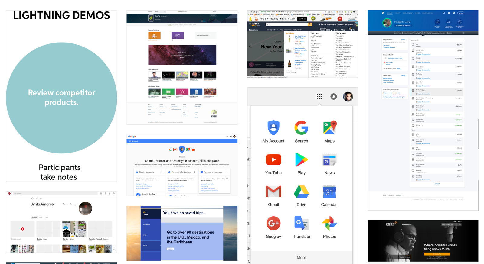
Method Gather as much data as we can to identify students needs at given times of their school semester. We also conducted interviews with 'experts' around Chegg. We ran a competitive analysis and began user interviews. We also planned to use the ADEPT method to setup our page/test.


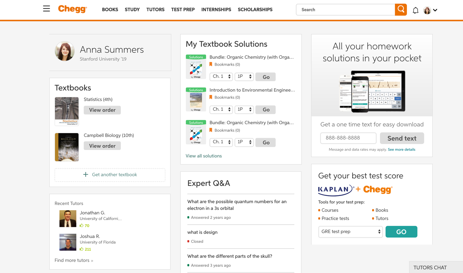
BEFORE

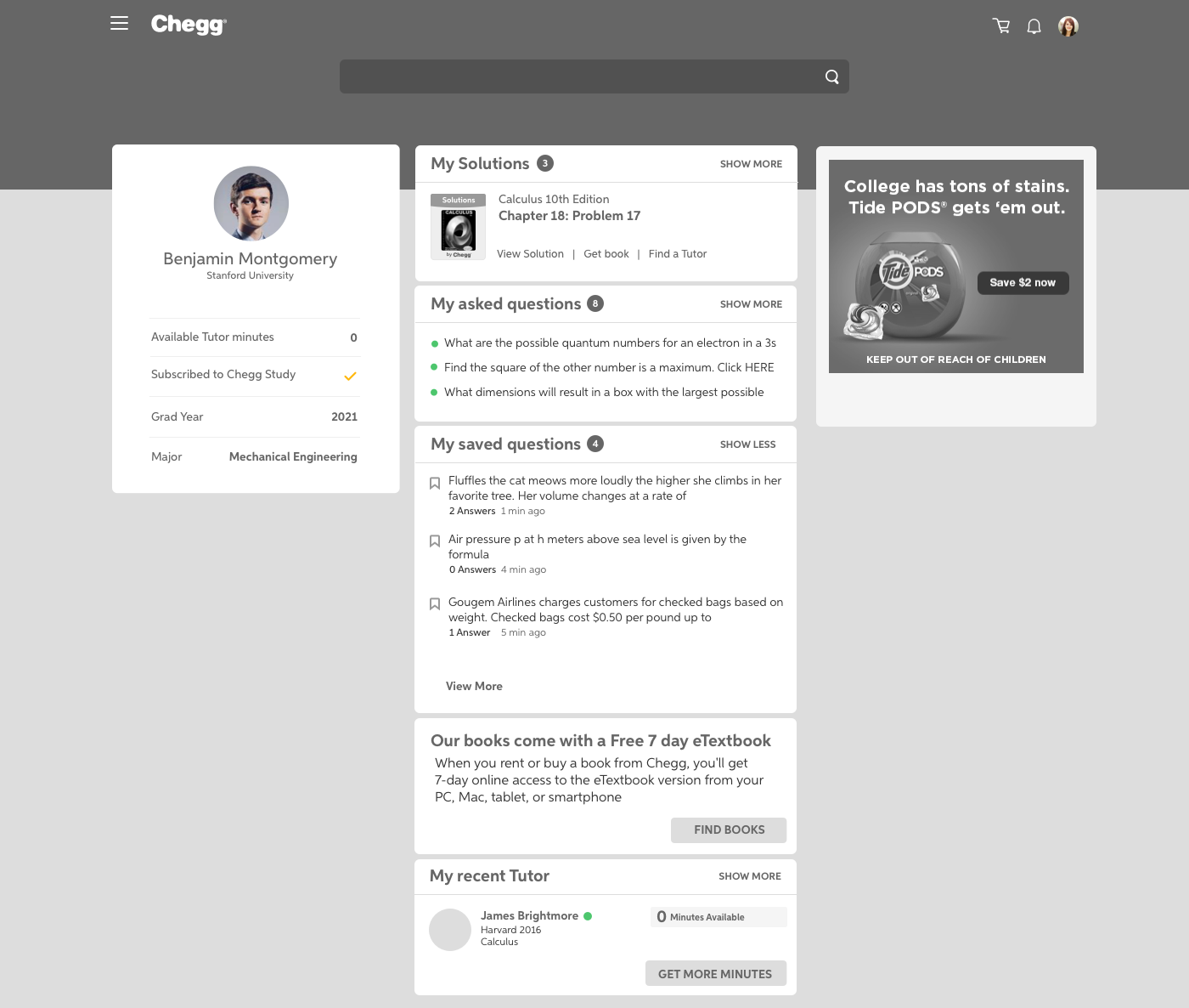
PHASE 1 Phase 1 was our first test which was a lot of content and testing different layouts. We found that these layout changes increased the engagement significantly. Students discovered new content and had easy access to content they used in the past.


PHASE 2 Phase 2 a.k.a dialing it back utilized our findings from Phase 1 and instead tooks the approach of testing each individual module. This helped testing since it was more focused.

THE RESULT We are currently still in phase 2, implementing each module and eventually we will get to personalized/dynamic home page. We had an astronomical overall engagement jump up to 70%!