Nook Surface App
- My Role: Lead UX designer, Creative Direction. The team consisted of myself, 1 visual designer, 1 user researcher and 1 PM.
- Platforms: MS Surface Web
" The Problem" Students needed the ability to get to their books, highlight and annotate from their Windows tablet devices. They also needed ways to easily organize their classes and materials with their respective semester.
Step 1: Bring on the students! We brought in students to get an idea of their study habits and how they organize their semester. We needed to understand their pain point and problems they were facing. Where they could use more efficiency in their life.
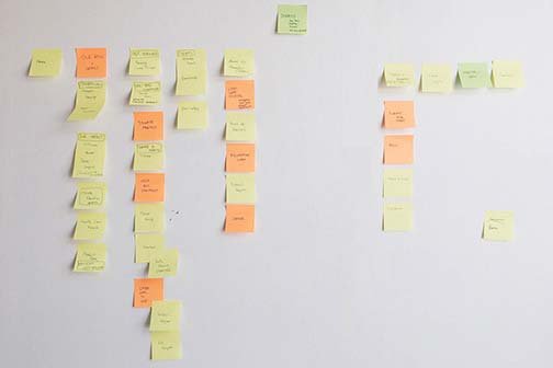
Step 2: Card Sorting We gathered those pain points and began to post solutions or ways we would go about solving them. Bucketed those post its to some main KPI's and worked with our PM to ensure we were in alignment with the business needs. After that, we did some crude A/B testing.
What we found We quickly realized that students used many different sources for study and annotating. In many cases, they would use common methods like physical notebooks for writing notes. FREE FREE FREE! That's what is mainly on their mind with respect to books. They would rather go through many leaps and hurdles to get the book for free rather than 1 or 2 simple clicks and your book is there instantly. We focused on two main key features that tested well with our students. Iterate and test fast!
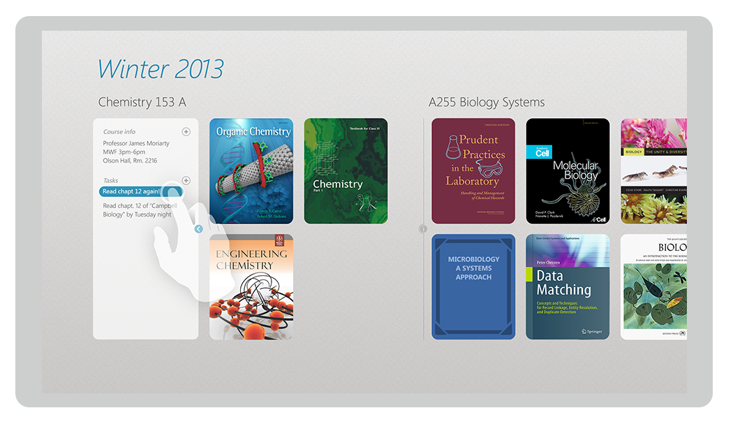
Manage your Courses During the sign in process, students would be able to easily identify their school and connect to their LMS (ILS) school system. After successfully connecting, it would pre-populate the screen with their current courses.
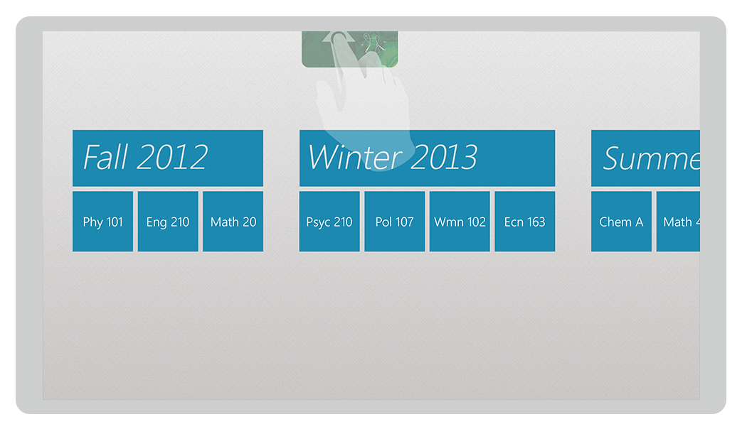
Along with the evolution cycle of this feature, we tested multiple methods of organizing and inputing courses. In the windows ecosystem, many students found it natural to drag and drop, moving through parallax levels of hierarchy.
Here, students could drag the entire semester, course or book and move them as they see fit.


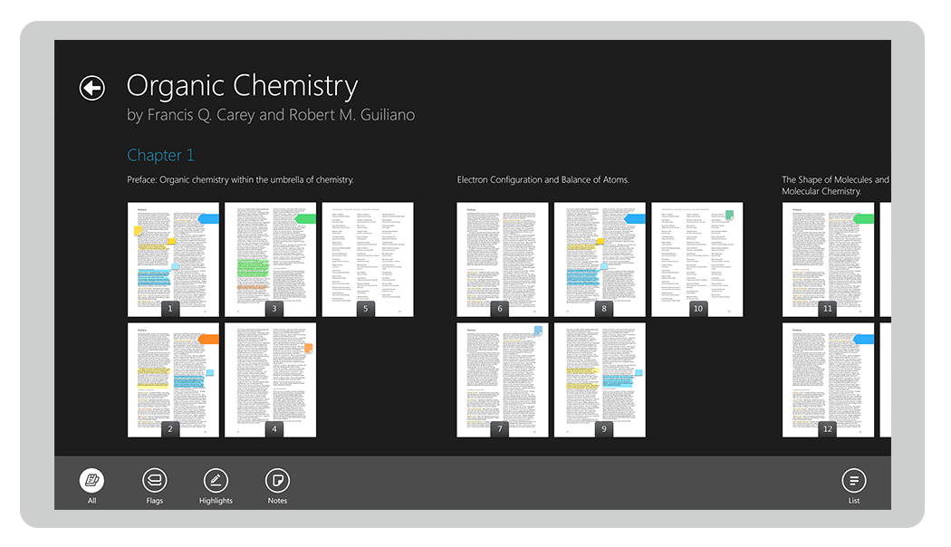
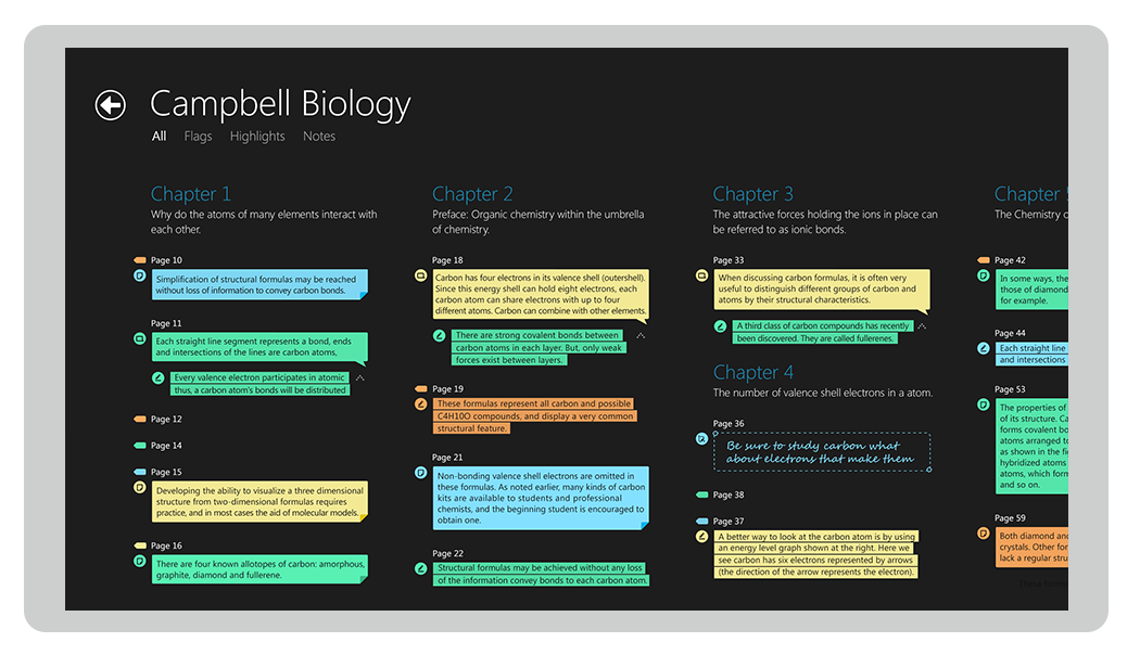
Highlight and make notes cognitive memorization actually played a part here where we found users would know by color code, the notes or highlights they put on a page per chapter, even on the thumbnails. We also found that page FLAGGING ( on the side of the page ) instead of a bookmark on top of the page made sense for users since these pages were an infinite vertical scroll.
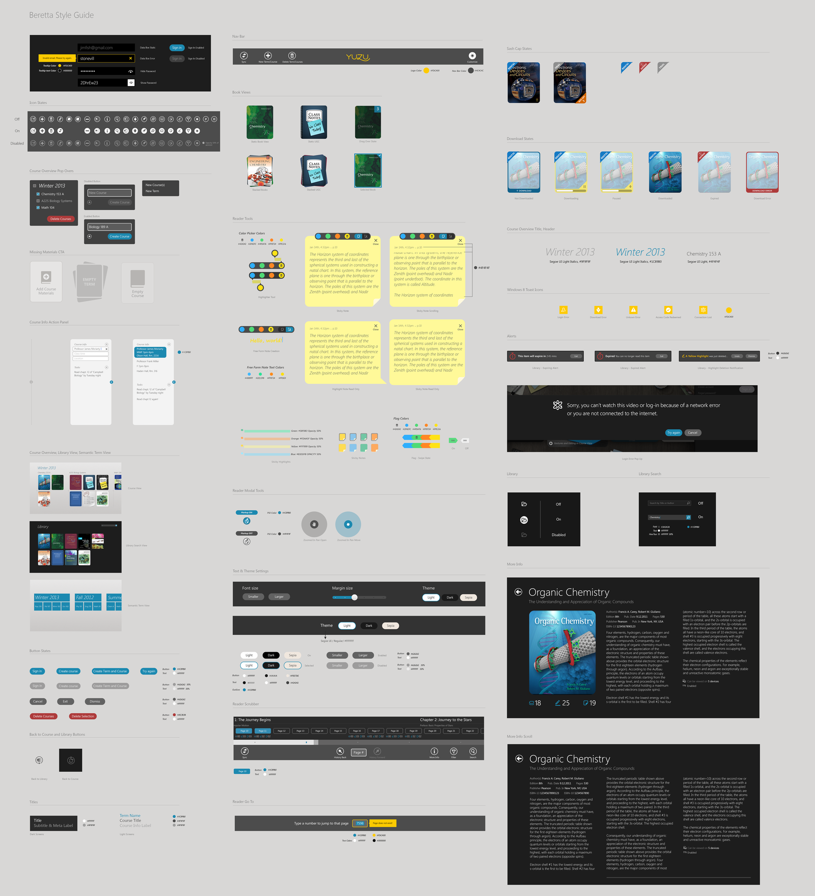
Visual design toolkit Lastly I put together the initial visual toolkit for the product and defined the CSS and typographic styles.
